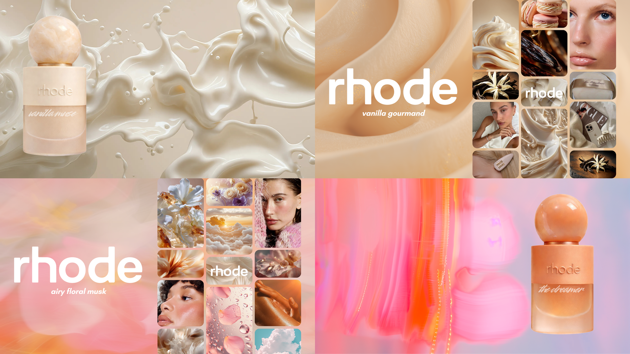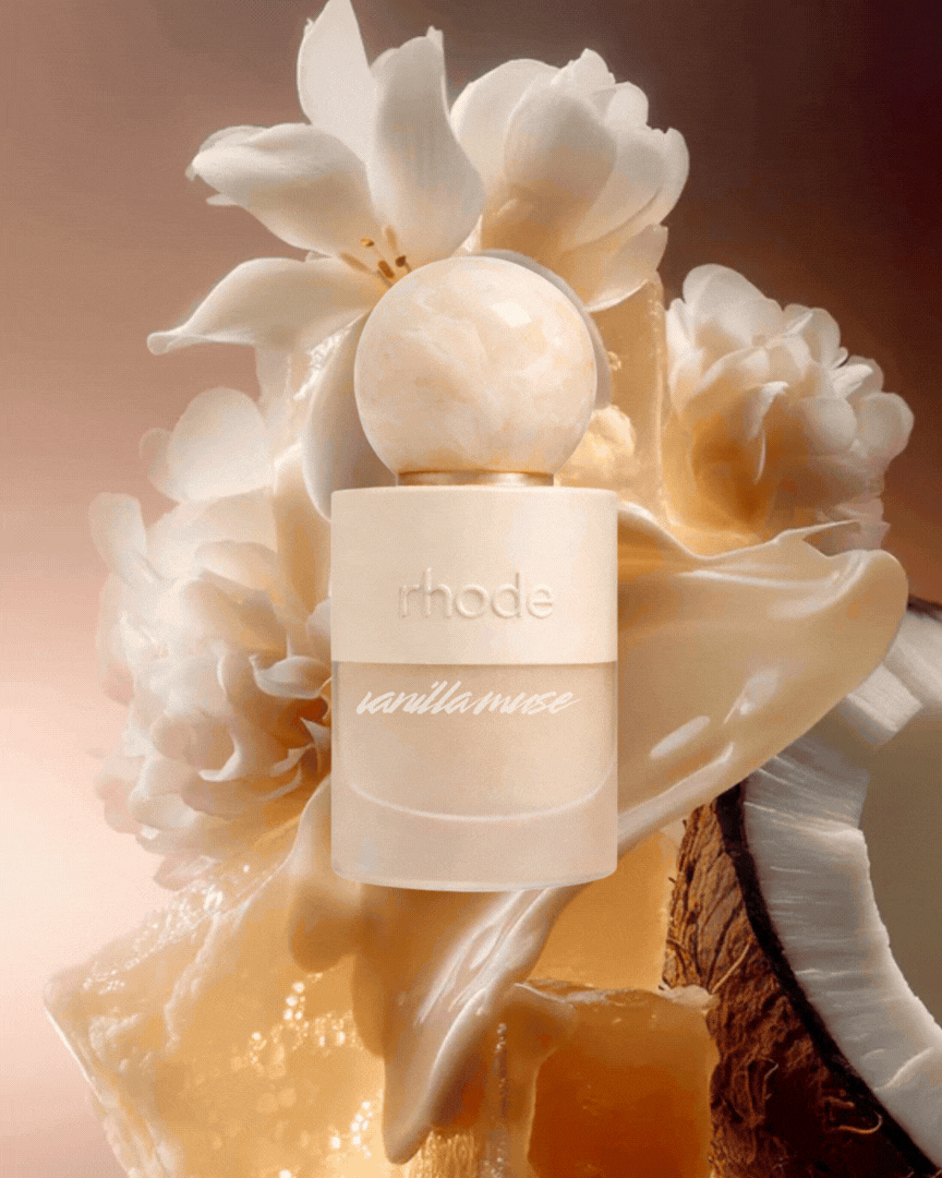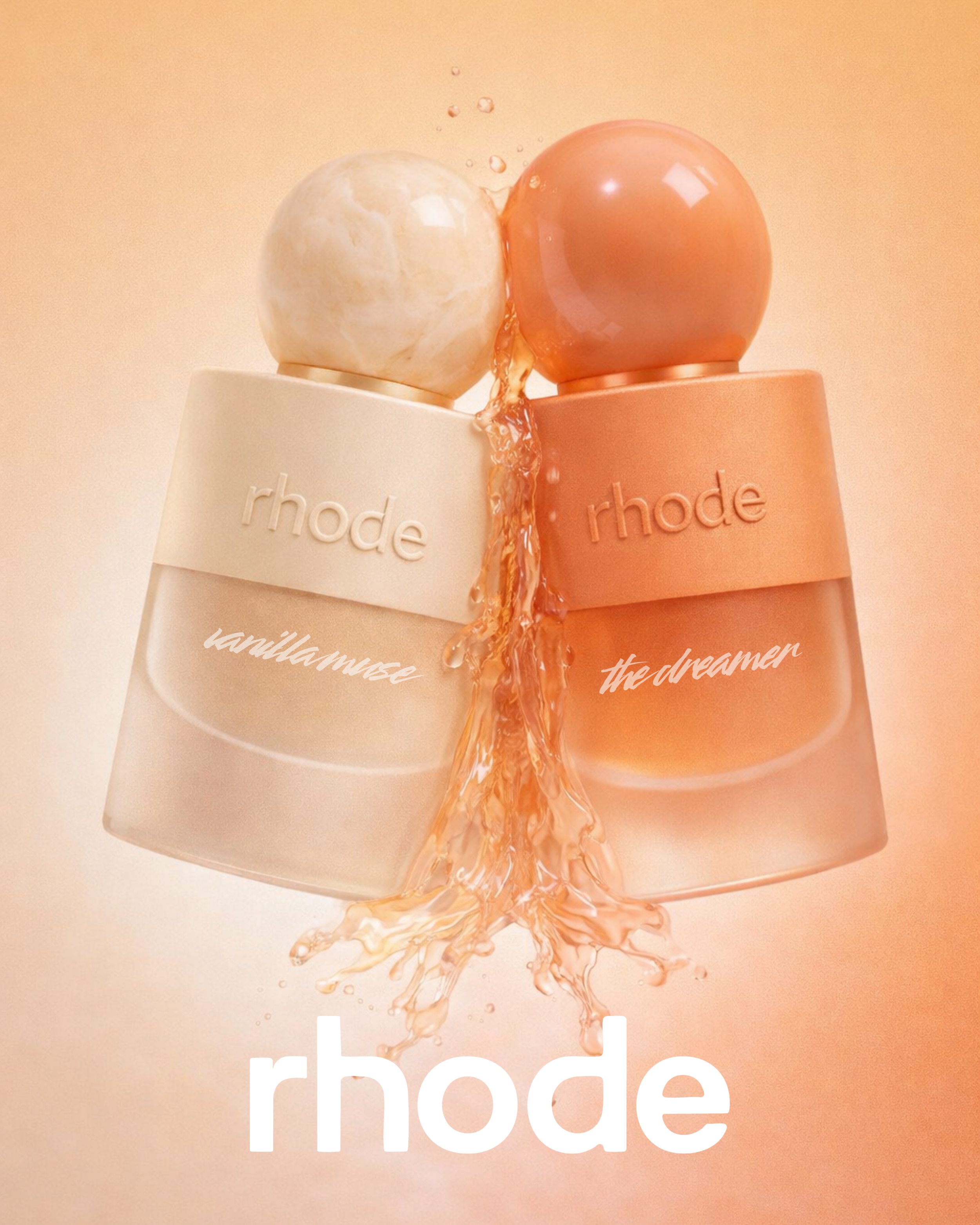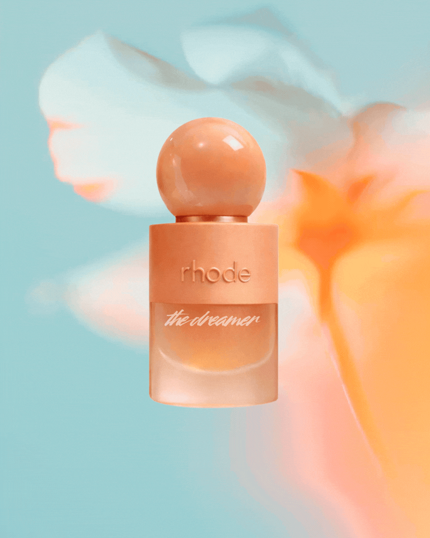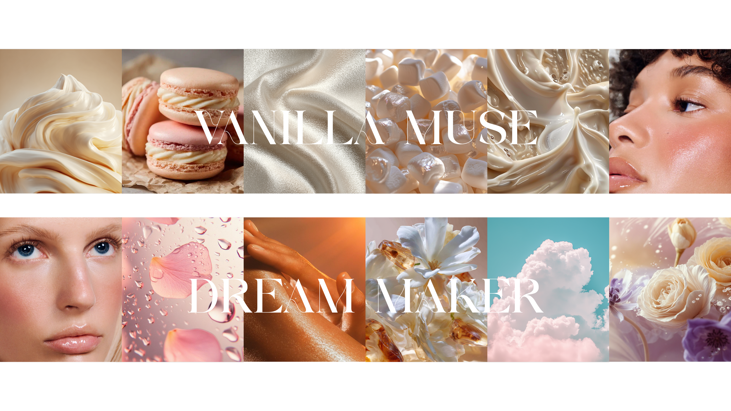
For this Rhode campaign concept, I developed the complete packaging look and feel centered around a Vanilla Dream narrative — an exploration of warmth suspended in air. The creative direction reimagines vanilla not as sweet or gourmand, but as skin-like, luminous, and softly enveloping.

The visual world lives in a palette of creamy ivories, warm sands, and muted nude tones, layered with diffused light and subtle glow to evoke an ethereal softness. I focused on materiality and tactility — satin finishes, soft-touch coatings, blurred gradients, and weightless transitions — to mirror the feeling of vanilla melting into skin.

Dreaminess is expressed through atmosphere: hazy edges, airy negative space, and barely-there radiance that makes the packaging feel suspended rather than solid. The typography remains minimal and intentional, allowing the color story and texture to carry the emotional weight.

The result is a cohesive packaging system that balances comfort and elevation — grounded in warmth, yet light enough to feel almost intangible. A modern interpretation of vanilla that feels intimate, clean, and quietly sensual within the Rhode universe.
RHODE
✳︎
RHODE ✳︎